iBrainy
Trivia Games for Seniors - Case Study
From Quizzes to Community: A New Approach to Brain Games for Seniors
2021
iBrainy began as a trivia platform with thousands of quizzes and a loyal fanbase, but struggled to monetize. I joined as the company pivoted toward building a meaningful, mobile-first experience for seniors 65+, blending brain training with social connection.
SERVICES
Product Strategy, UI/UX Design, Research, Art Direction

Project Overview
Objectives: Redesign and reposition a legacy trivia platform for a new audience of seniors 65+, turning it into a mobile-first experience that promotes cognitive wellness, combats loneliness, and fosters community. The goal was to transform a static quiz site into an engaging, accessible tool for brain training, knowledge sharing, and meaningful connection.
iBrainy was reimagined for older adults seeking mental stimulation and social interaction. We built a calm, intuitive app that blends learning and connection—designed specifically to support memory, self-esteem, and a sense of belonging in later life.
Approach

Old Persona vs. New Persona We realized we needed to shift our persona when trivia nerds showed high engagement but no willingness to pay. Seniors, on the other hand, value connection, brain health, and are more open to paying for features that feel meaningful and supportive.
Hypothesis
We believe serving seniors will provide greater value by supporting memory, reducing loneliness, and fostering connection. We expect them to value simplicity and be more willing to pay for features that enhance daily life.
Old Persona – The Trivia Nerd
Our original users were competitive, knowledge-obsessed trivia lovers. They craved challenge, obscure facts, and leaderboard rankings. While highly engaged, they were resistant to paying and primarily used the app as a personal brain sport.
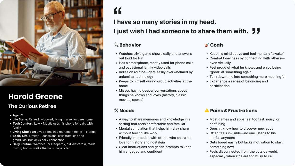
New Persona – The Curious Senior
Our new target users are older adults (65+), often living alone and looking for meaningful connection, mental stimulation, and a sense of purpose. They value simplicity, community, and content that feels nostalgic and rewarding—not competitive.
Competitive Research
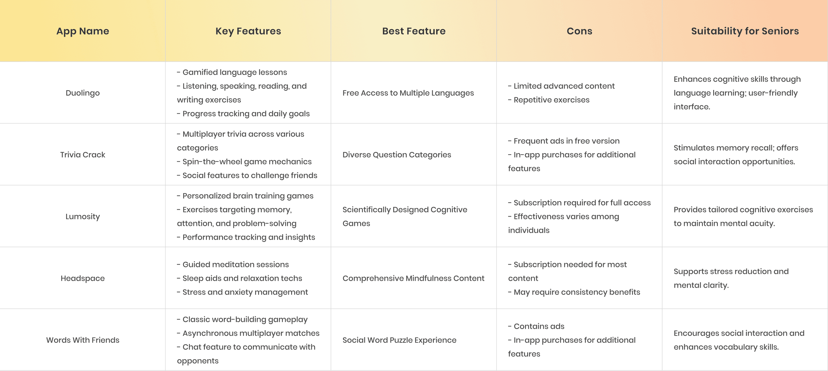
To better understand the landscape, we analyzed popular apps targeting cognitive health, trivia, and social engagement. Apps like Duolingo, Lumosity, and Trivia Crack offered strong gamification and brain-training features, while others like Headspace and Words With Friends focused more on emotional well-being and connection. However, most apps lacked the accessibility, simplicity, and emotional relevance needed for senior users—highlighting a clear opportunity for iBrainy to stand out by combining learning, connection, and ease of use in one tailored experience.
Research Plan + Interview Questions / Script
I mapped out the research plan, followed by my research interview questions. Here’s what I wanted to hone in on:
A deeper understanding of the lifestyle, needs, and routines of older adults (65+), especially around cognitive engagement and emotional connection.
Learning how older adults currently spend their free time and use technology—specifically games, learning platforms, or community apps.
Exploring their relationship to memory, social connection, and self-worth—especially as it relates to sharing their knowledge or staying mentally sharp.
Discovering what features would motivate them to return to the app regularly and what they might actually be willing to pay for.
My thinking:
Memory loss, loneliness, and the desire to feel purposeful or connected are incredibly human experiences—especially in later stages of life. I believed that hearing a range of voices within this age group would give me better insight into how to design an experience that is not just fun, but truly meaningful and accessible.
Some participants were trivia lovers. Others were simply curious about tech or looking for a new way to connect with people. That range allowed me to see the product through multiple lenses: as a brain-training tool, a digital companion, and even as a source of pride.
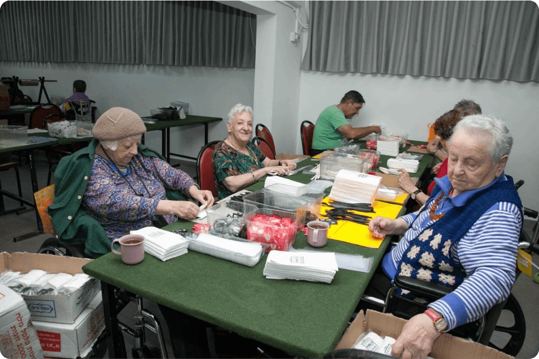
We went to an elderly home in Raanana, and interviewed a few seniors. They were thrilled to be interviewed and answer questions!
What we learned 🧠 1. They Value Cognitive Health Over EntertainmentParticipants showed interest in tracking their memory progress and receiving brain-health tips, indicating a desire for self-improvement. iBrainy can position itself as both a fun trivia app and a personal wellness tool for cognitive longevity. 💬 Martha found tracking "reassuring," while Benjamin likened it to meditation or learning Spanish—this is more than just casual gameplay. 🧓 2. They Crave Peer ConnectionEven the least tech-savvy users, like Rivka and Benjamin, were eager to connect with peers through trivia that sparked memories. Many products assume older users prefer simplicity and isolation, but this group showed a desire for community through shared experiences like music and TV shows. This could set iBrainy apart.💬 Rivka: “If the trivia brings back memories, I’d love to share my experiences.” 💬 Benjamin: “I might need a nudge, but I see the benefits.” 📱 3. They seek Emotional ValueMany users are cost-conscious, but some would pay for features like live trivia nights or video chats if the app fosters connection and happiness. Monetization is viable if it’s emotionally meaningful—paywalls for deeper connections or nostalgic features may be more attractive than generic "pro access". 💬 Itzhak: “If it made me happy and I used it often.” 💬 Miriam: “I wish I had like minded people to feel connected with.”
🔍 Define

🏛️ Backed by Gov-Tech Insights During the project, we teamed up with the Israeli government’s digital accessibility program for seniors (in collaboration with JDC, משרד הדיגיטל הלאומי, and ג’וינט אשל). They provided us with an incredible research-based guide, packed with practical UX recommendations for designing inclusive digital products for users aged 65+. This guide helped validate our assumptions, filled in knowledge gaps, and gave us a solid foundation for creating a truly age-friendly experience.
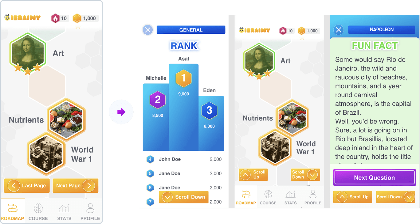
Feature Roadmap
This roadmap prioritizes core engagement first, starting with a fun trivia game and educational facts Phase 1.
Next, we introduce deeper learning and personal progress tracking Phase 2.
Followed by leaderboards to spark friendly competition Phase 3.
Finally, we add social features like Game Nights to foster community and reduce loneliness Phase 4.
Each phase builds on the last to increase value, connection, and long-term retention.

Task Flow
To kick off the design process, we first mapped out the main user flow to build a simple prototype we could test early on. This flow walks through the core experience—opening the app, choosing a quiz, answering questions with instant feedback and fun facts, and ending with a gentle summary. It helped us focus on what mattered most to users and quickly validate the basic interaction patterns.

What We Learned
✅ 1. Simple Structure & Easy Navigation
Minimize clutter and highlight key actions.
Use clear menus, consistent layout, and breadcrumbs.
Prioritize recognition (not memory), and avoid hidden elements.
✅ 2. Clear, Supportive Language
Use simple, direct language — no slang or jargon.
Add labels to icons, explain actions, and give positive feedback.
Error messages should guide users calmly, not blame them.
✅ 3. Accessible & Comfortable Visual Design
Use large fonts (18px+), high contrast, and Sans Serif typefaces.
Ensure big, well-spaced buttons.
Don’t rely on color alone — combine it with text or icons.
✅ 4. Inclusive Forms & Research
Keep forms short, avoid unnecessary steps (like password confirmation).
Offer easy login options (like one-time codes).
Test with real users 65+ and design based on their real needs.
Our early roadmap focused on layering value gradually—starting with core gameplay and evolving into deeper learning, friendly competition, and social connection. By mapping a simple user flow and grounding our work in senior-focused UX research from Israel’s Gov-Tech initiative, we created a design foundation that was both accessible and emotionally meaningful. Every decision was guided by the real needs of older adults: clarity, comfort, and connection.
✏️ Ideate & Test

"45% of adults 65+ use social media, making them the least active demographic, though their presence has quadrupled since 2010" -Retirement Living Journal
First Design Sketches
Instead of starting with black-and-white wireframes, we jumped straight into a full-color prototype. Based on insights from our senior-focused UX research, we knew that abstract wireframes would be confusing for our audience. Seniors respond better to bold colors, clear visuals, and realistic screens—so we designed high-fidelity mockups early on to test the full experience in a way that felt familiar and intuitive to them.

User Testing
We brought the prototype back to the same seniors we interviewed and asked them to explore it freely—no instructions, just play. Watching how they tapped, scrolled (or didn’t), and reacted to the design gave us invaluable insights. Their feedback and behavior helped us spot hidden usability issues and better understand how to shape the experience around their needs.

Here’s what we learned
⏱️ Time pressure creates stress Timed quizzes felt overwhelming and made users feel like they were “failing.” Removing timers created a more relaxed, enjoyable experience.
📖 They read everything—and dislike icons Seniors don’t skim. They prefer text over icons and get confused when buttons aren’t clearly labeled with words.
🤳 Seniors hold their phones differently They often hold the phone in one hand and tap with the other, so all key actions need to be easy to reach and accessible near the bottom of the screen.
📱 Scrolling is a problem Some users didn’t realize they could scroll, while others physically struggled due to shaky hands or conditions like Parkinson’s.
🔊 Some prefer to listen, not read Several users said they would rather hear the questions and answers out loud than read them on screen.
🔍 Big text isn’t always big enough Even though we used large fonts, some users needed an even larger option to comfortably read the content.
We skipped traditional wireframes and tested high-fidelity designs early to match how seniors actually interact with tech. Real user feedback revealed key accessibility needs—like removing timers, labeling everything clearly, and offering audio and extra-large text options.
🛠️ Refine

User testing gave us great insights about real users, and with that we turned feedback into features
⏱️ Time pressure creates stress
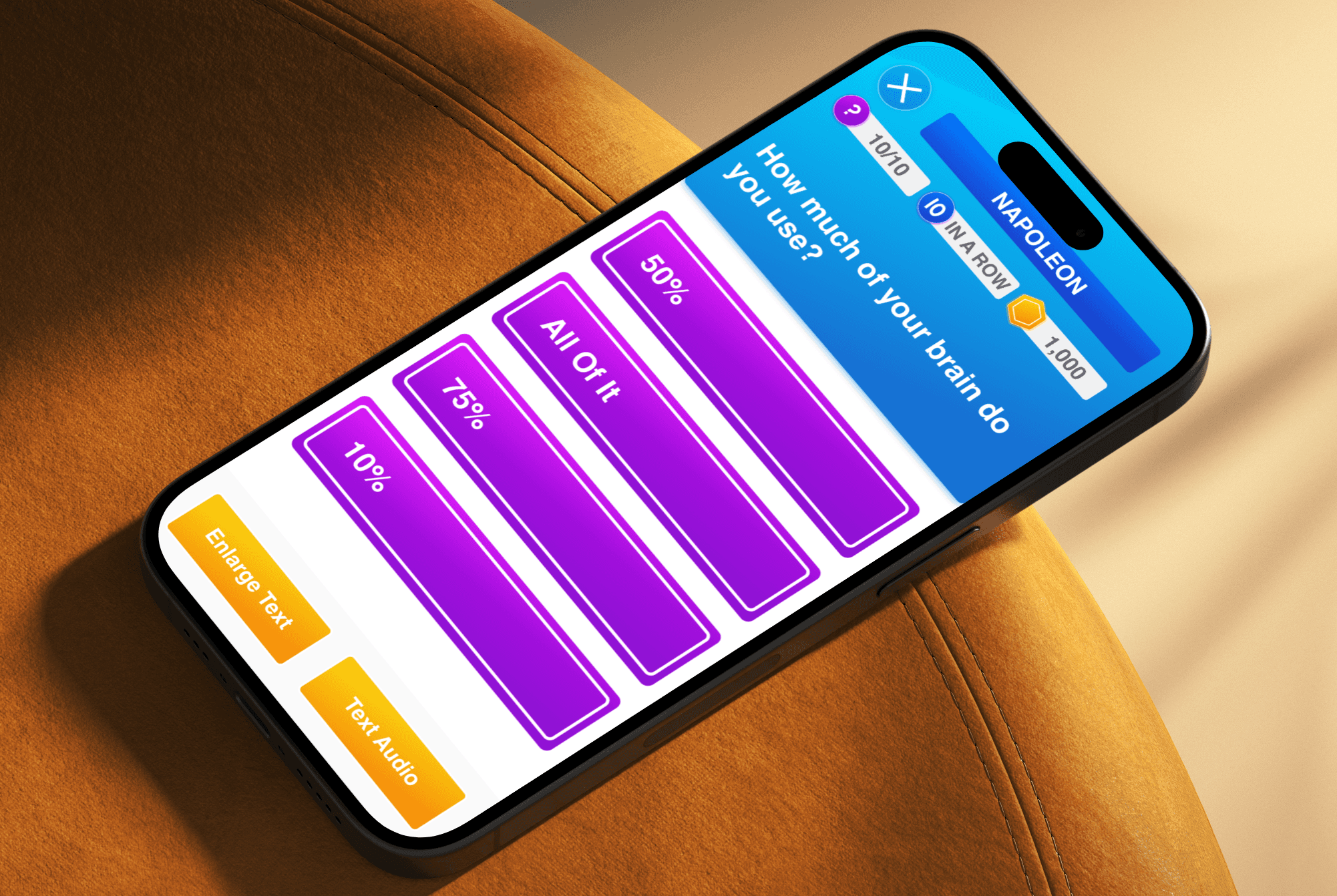
Timed quizzes felt overwhelming and made users feel like they were “failing.” Removing timers created a more relaxed, enjoyable experience.

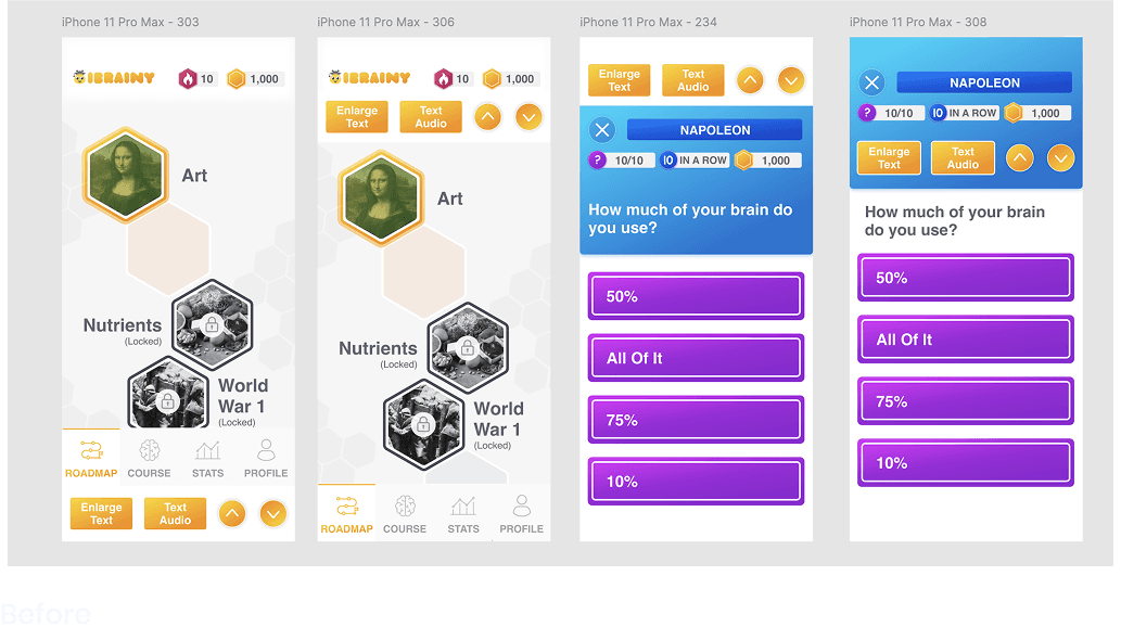
The old version of Quiz Beez, made for trivia nerds, the timed questions made the game more fun and exciting cause they had to guess fast. We noticed that for seniors this made next anxious cause they didn’t even finish reading before the timer went off. We decided to remove this completely
📖 They read everything & dislike stand alone icons
Seniors don’t skim. They prefer text over icons and get confused when buttons aren’t clearly labeled with words.
At first in order to save room for other elements (since everything is very big), we made clean icons for the menu and for all buttons on the app.
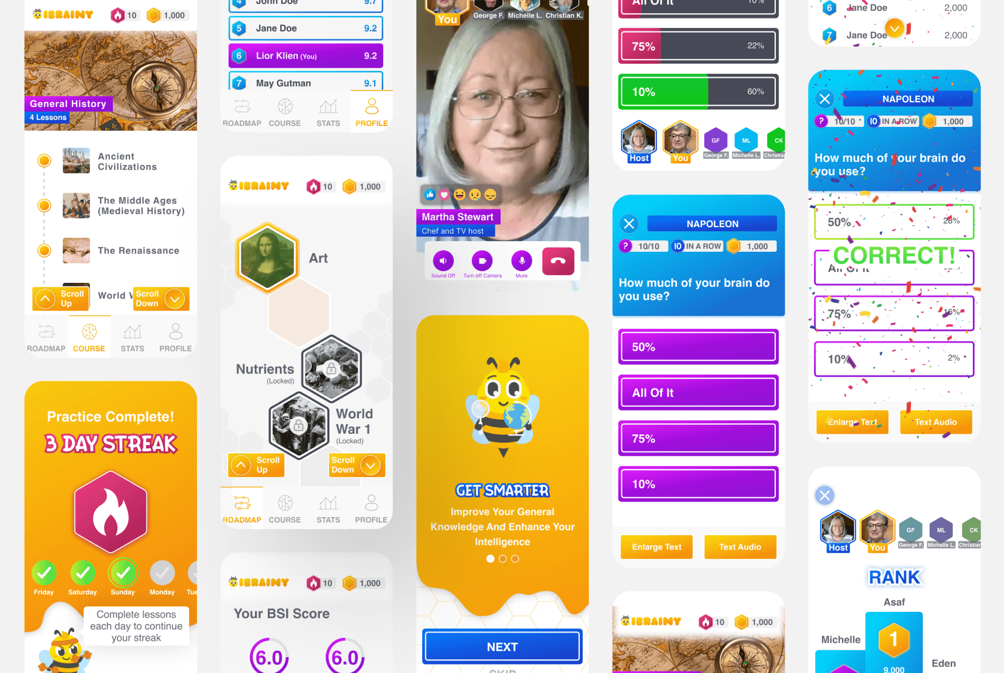
When testing we realized they like big buttons that say EXACTLY what they do, and no hidden layers. So we added a label to EVERY button on the app including the main menu.
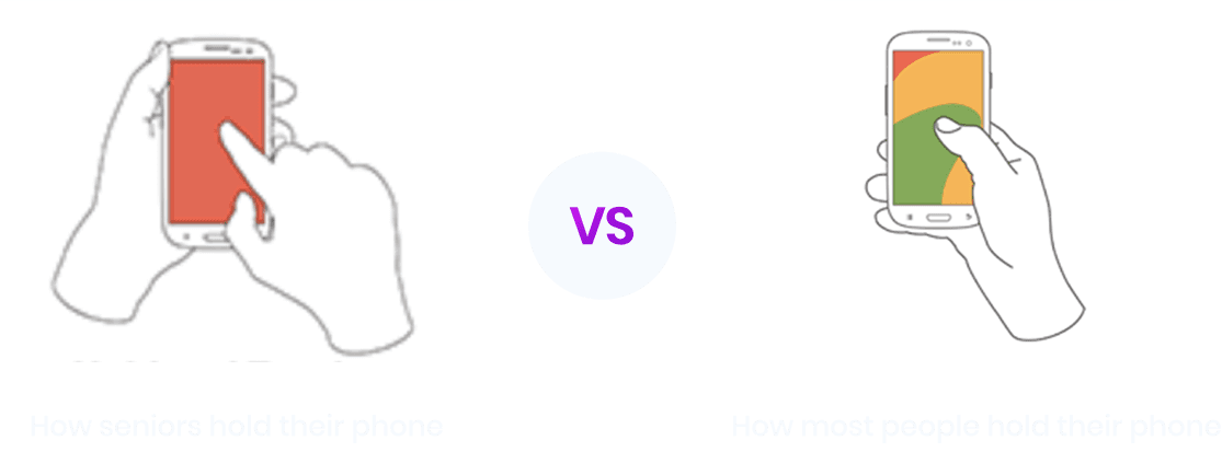
🤳 Seniors hold their phones differently

Why this is important?
When designing for mobile apps, usually the top half of the screen is informative, and the bottom where it’s ‘easy to reach’ with your thumb, I usually place important buttons and navigations and avoid putting elements that someone needs to click.
With seniors, since they are holding the phone with one hand, and using their other hand to click, IT CHANGES EVERYTHING.
Every place on the screen is clickable and ‘easy to reach’
Scrolling can become difficult
Both of their hands are occupied which makes them focused on their phone, and not on anything else
📱 Scrolling is a problem
Some users didn’t realize they could scroll, while others physically struggled due to shaky hands or conditions like Parkinson’s.
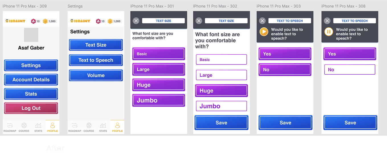
Since some seniors don’t understand the concept of scrolling, I preferred to make all pages have a ‘next page’ since this resonates more with their behaviors. Unfortunartley, the developers were too far into the dev process and all screens were created as ‘scrollable’, so there was no going back. We added a ‘Scroll up’ and ‘Scroll Down’ buttons on all pages so it would be quicker to implement.
🔊 Making Accessibility Stick: Audio & Text Enlarger
At first, we added a read-aloud button and text enlarger to individual screens—but through testing, we realized that once users turned these on, they expected them to stay on. So we made them global features: users can now activate audio and larger text during onboarding or from the settings menu, and those preferences apply across the entire app experience automatically.
User testing helped us spot critical usability gaps—so we refined the product around real senior behaviors. We removed timers to reduce stress, added labels to every button, rethought layouts based on how seniors hold their phones, introduced scroll buttons, and made accessibility features like audio and text size global settings. Each change brought us closer to an experience that truly fits our users.
🎨 UI & Design

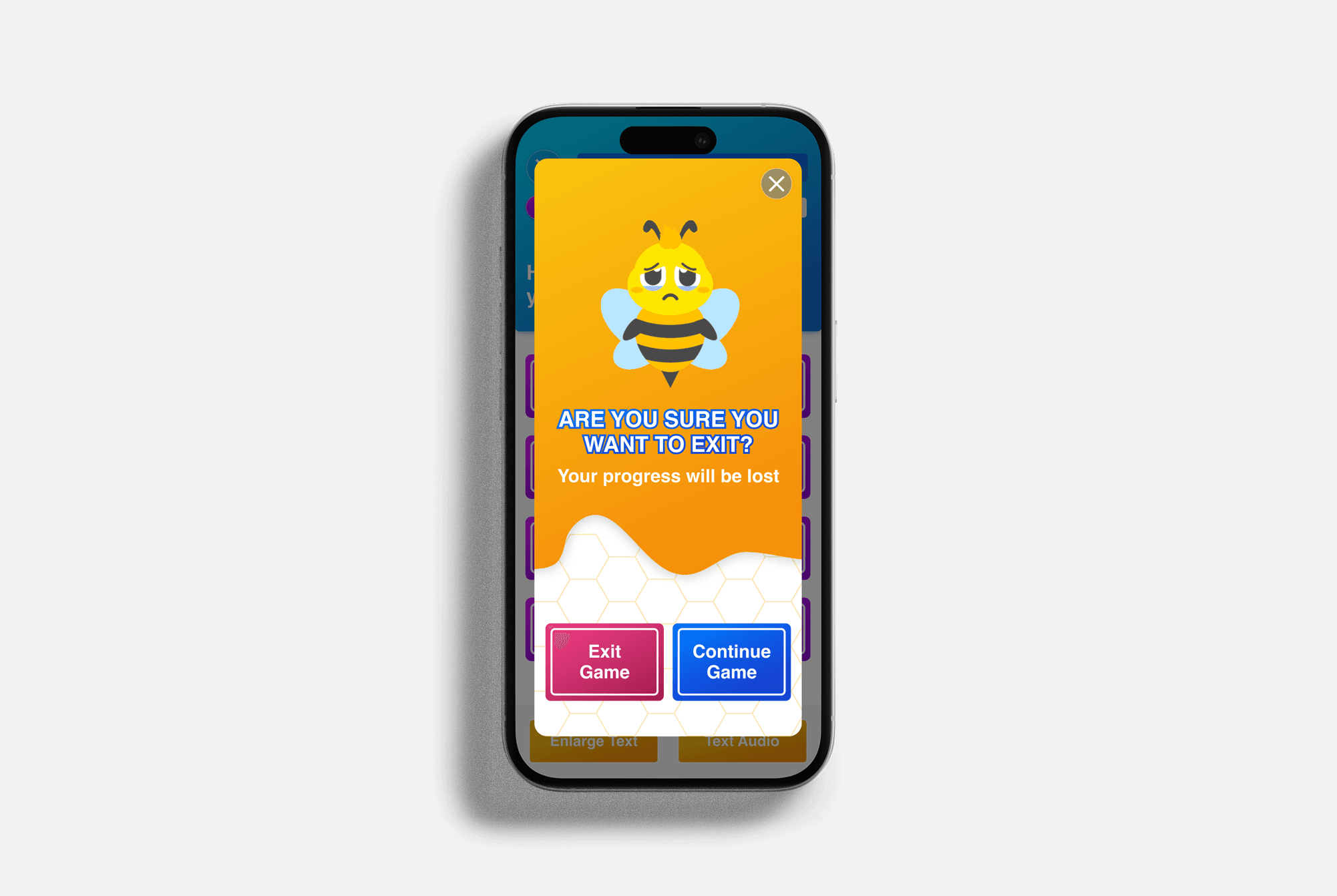
Meet the new iBrainy Bee — animated, expressive, and designed to bring joy and personality to every quiz experience.
🐝 Evolving the Bee: From Quiz Beez to iBrainy
At first, we considered removing the original Quiz Beez mascot—but users loved it. Even though it felt a bit childish, it clearly resonated with seniors. So instead of replacing it, we gave the bee more personality and depth. Working with a freelance illustrator and animator, we created expressive poses, themed outfits, and a friendlier design that felt both fun and familiar.

🎨 Building the UI Kit
I designed a fully accessible UI kit, testing colors, fonts, and button styles to make sure everything was readable, clear, and easy to use for seniors. I paid close attention to contrast and sizing to meet accessibility needs. To keep things playful and on-brand, I used hexagon shapes throughout the interface (a subtle nod to the bee theme), and added honey-drip elements in the onboarding flow to make the experience feel warm and familiar.

A playful, expressive mascot and thoughtful visual design helped create a warm, accessible experience that felt familiar and inviting—proving that even small design details can build big emotional connection.
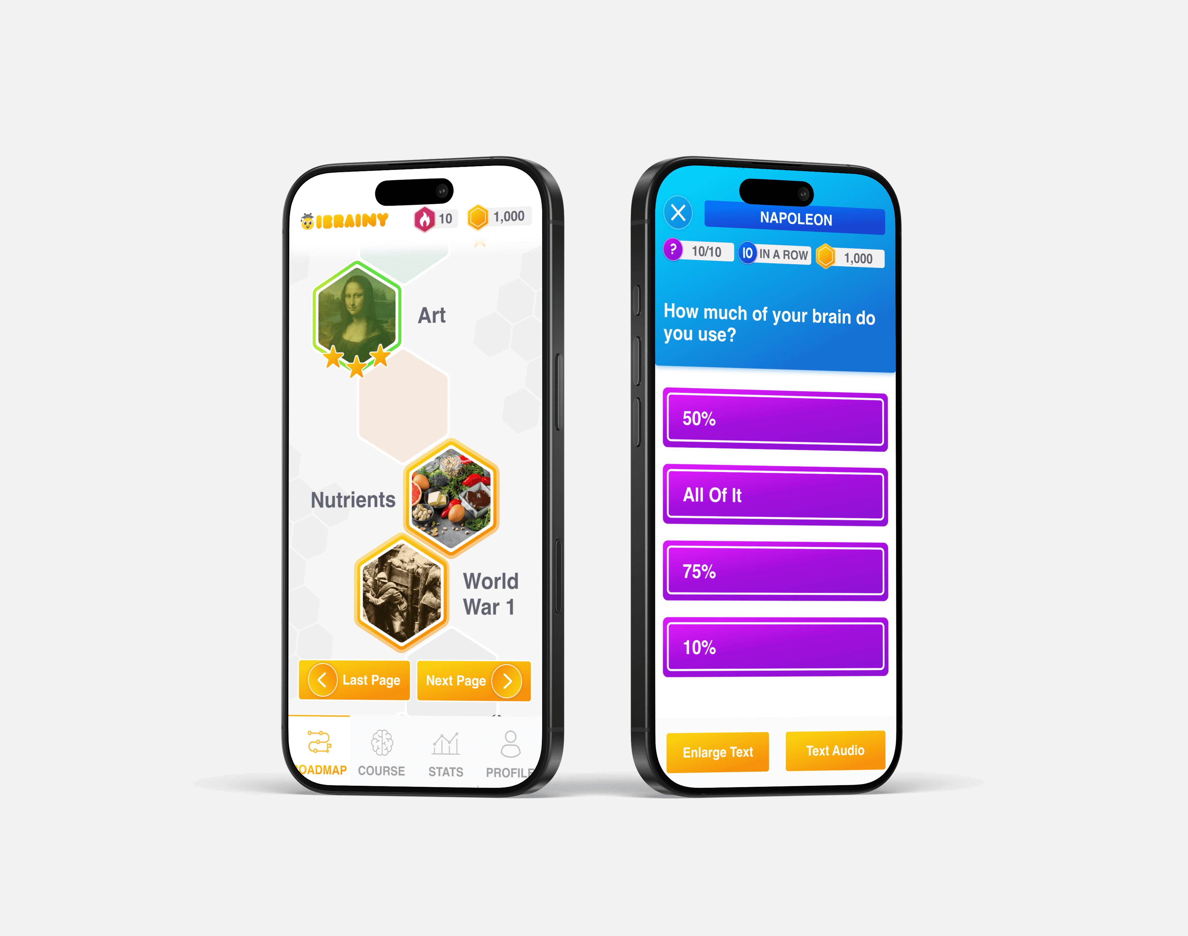
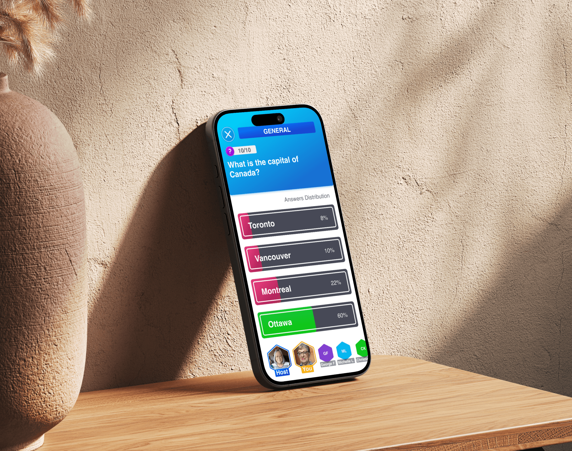
✨ Prototype
We created a calm, colorful mobile experience that feels inviting, intuitive, and joyful—tailored to the unique needs of seniors 65+.
The final design blends playful visuals with accessibility best practices: large text, audio support, clearly labeled buttons, and friendly interactions. From the mascot animations to the quiz experience, every detail was crafted to make users feel smart, connected, and in control.

Accessibility is always a priority—but in this project, it was THE priority. Accessibility came before aesthetics. Some parts of the UI aren’t pretty—but every choice was made to support usability for real seniors, and that sometimes matters more than beautiful design.
Final Product